Note
Click here to download the full example code
Flow Density Layout
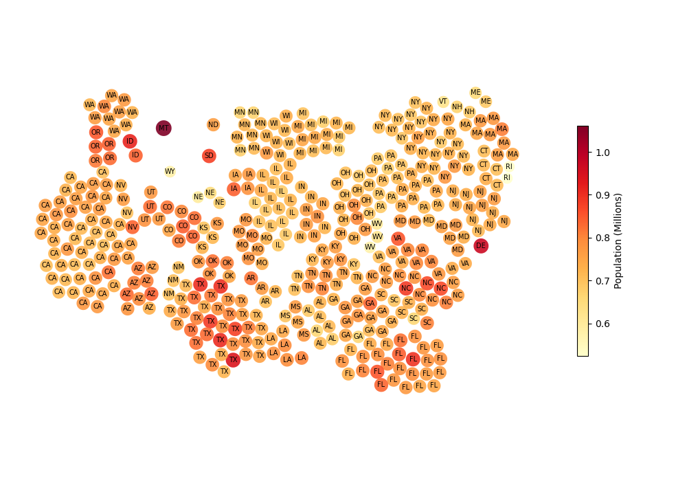
Create a symbol cartogram with circles positioned using the flow density layout. The algorithm builds a divergence field from Gaussian blobs at predicted contact points and advects circles through the resulting velocity field. Circles cluster by state, with no attraction between districts of different states.
Load congressional district data and create the cartogram. Each district is sized proportionally to its population, and districts are grouped by state so that cross-state attraction is disabled.
import matplotlib.pyplot as plt

import carto_flow.data as examples
import carto_flow.symbol_cartogram as smb

us_districts = examples.load_us_census(population=True, level="congressional_district")

symbol_carto = smb.create_symbol_cartogram(
    us_districts,
    "Population",
    group_by="State Name",
    collapse_group=0.5,
    layout=smb.FlowDensityLayout(
        spacing=0.15,
        cross_group_pull_scale=0.0,
        max_iterations=750,
        convergence_tolerance=0.05,
    ),
    size_normalization="total",
    show_progress=False,
)
Plot the result. Each circle is one congressional district; color encodes population. Districts from the same state cluster together.
fig, ax = plt.subplots(1, 1, figsize=(10, 7))

_ = symbol_carto.plot(
    ax=ax,
    column="Population (Millions)",
    cmap="YlOrRd",
    label="State Abbreviation",
    label_fontsize=7,
    legend_kwds={"shrink": 0.5, "label": "Population (Millions)"},
)

plt.tight_layout()
Total running time of the script: ( 0 minutes 4.567 seconds)
Download Python source code: plot_symbol_flow_density_layout.py
Download Jupyter notebook: plot_symbol_flow_density_layout.ipynb